INDG.
Web design and design system for a visual production company — resolving the coexistence of two brands that shared an origin but not a visual language.

/
Challenge
(01)
Two brands sharing a space — one was erasing the other.
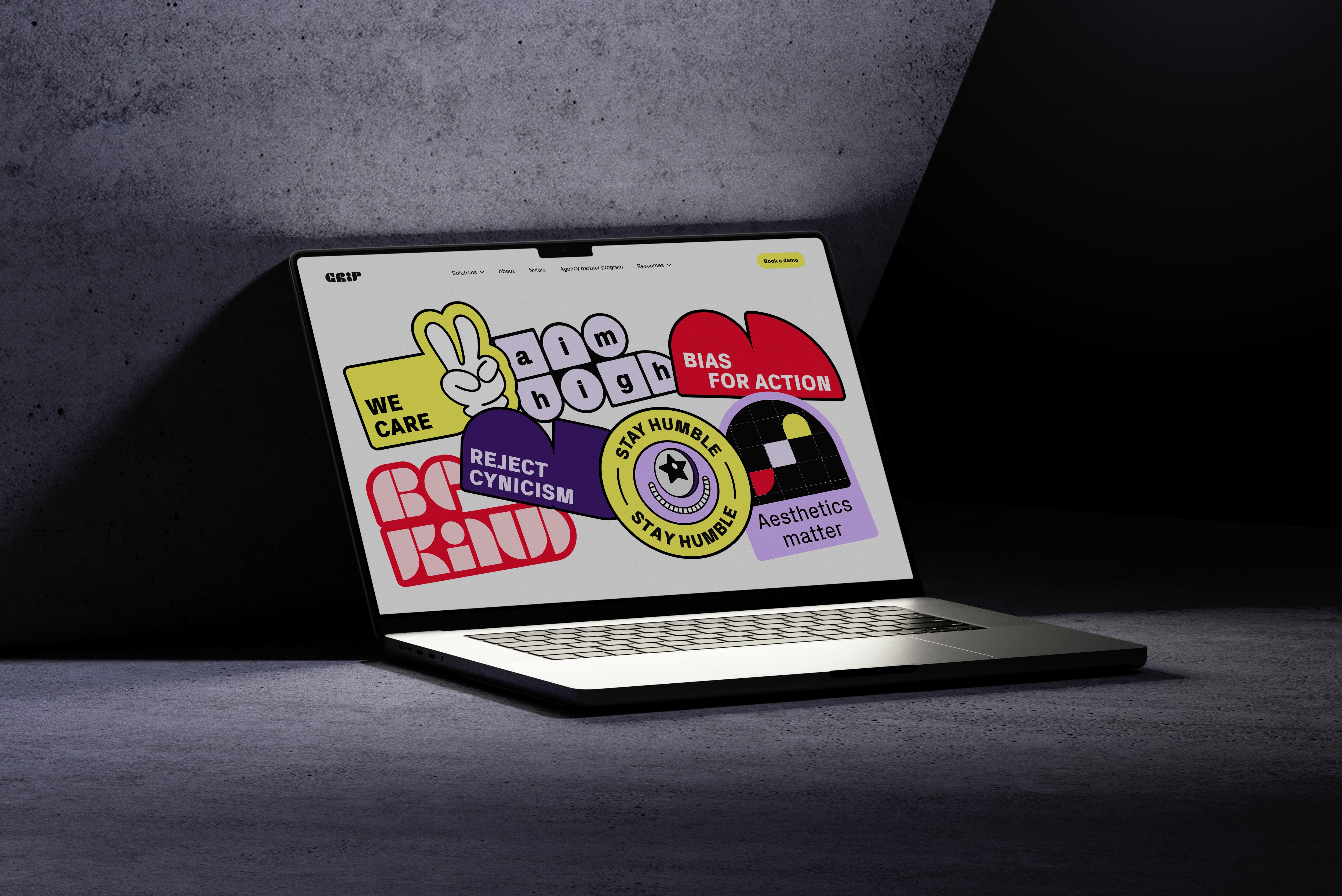
INDG is a technology-first visual production company operating at enterprise scale. GRIP is its enterprise software platform — visually strong and growing fast. But INDG's own identity had been left behind: no coherent color system, no visual foundation of its own. When both brands appeared together, GRIP's strength threatened to erase INDG's presence entirely. The challenge wasn't just visual — it was deciding how two distinct brands with a shared origin could coexist without one cannibalizing the other.


/
Solution
(02)
Coherence over novelty — extending a system rather than reinventing it.
The creative decision was to extend the existing design system across all layers of the INDG web ecosystem rather than create something new. Building on top of what already worked for GRIP meant the two brands could share a visual foundation while remaining distinct where it mattered. I designed the full web ecosystem — from the joint entry point introducing both brands, through the corporate homepage, to the industry pages — adding sector-specific components where needed without breaking the system underneath.


/
Conclusion
(03)
Two brands. One coherent system. Neither lost.
The result was a digital ecosystem where INDG could finally hold its own — visually consistent from the entry point to every industry page, clearly distinct from GRIP where needed, and connected to it where it made sense. A foundation built to be presentable today and extensible as INDG's identity matures.

Latest Projects.
Projects where aesthetic vision and strategic thinking had something real to solve.